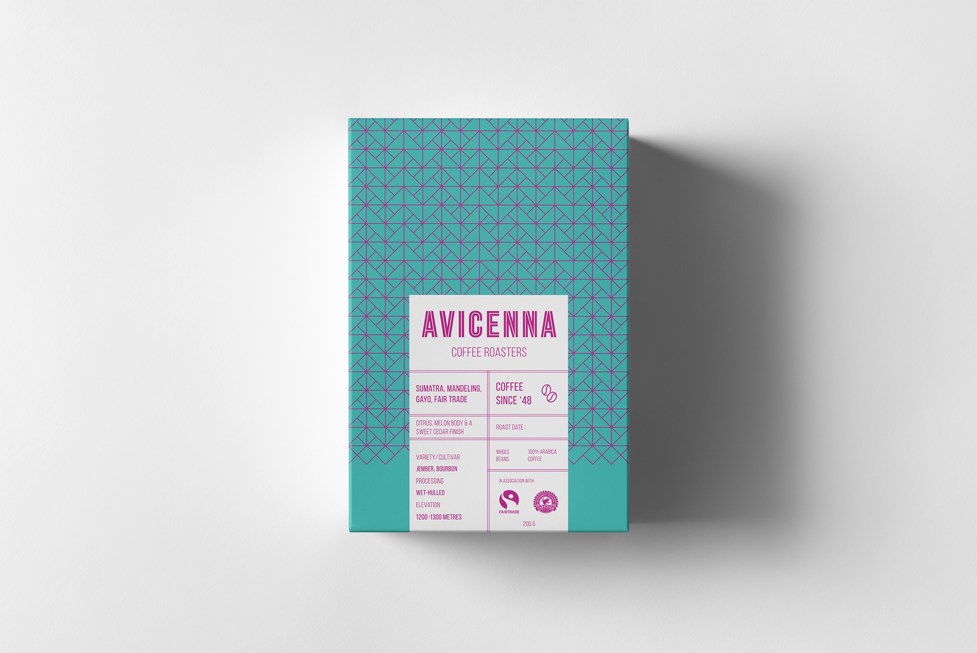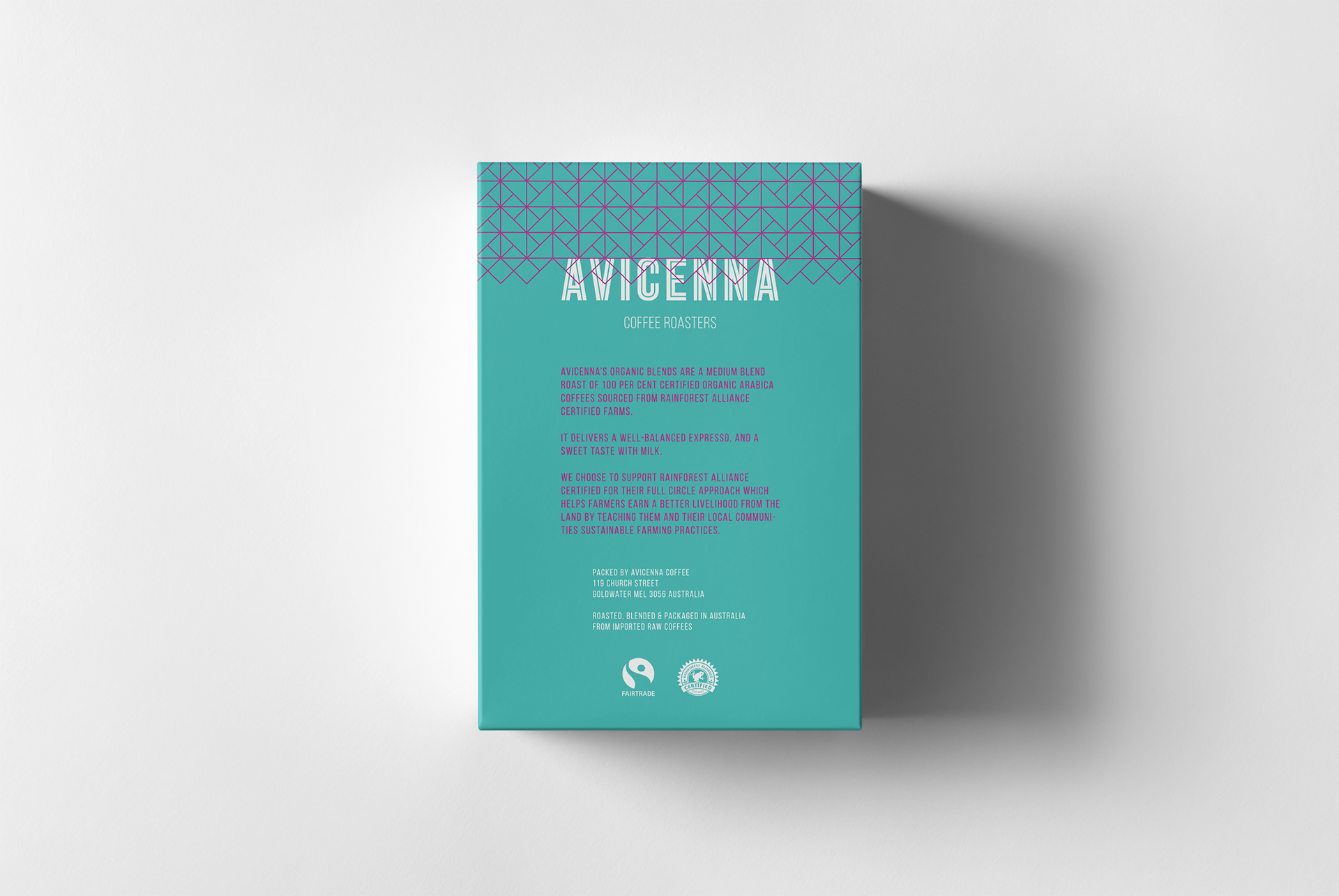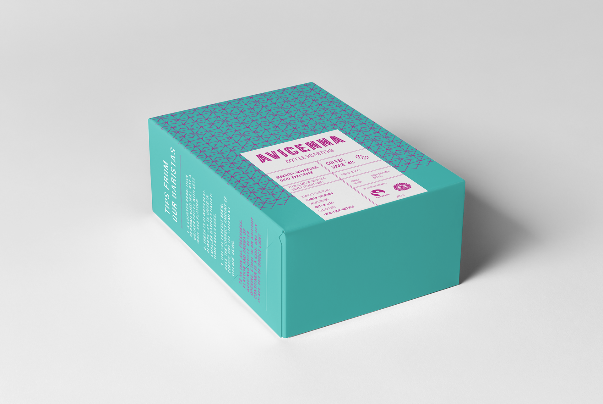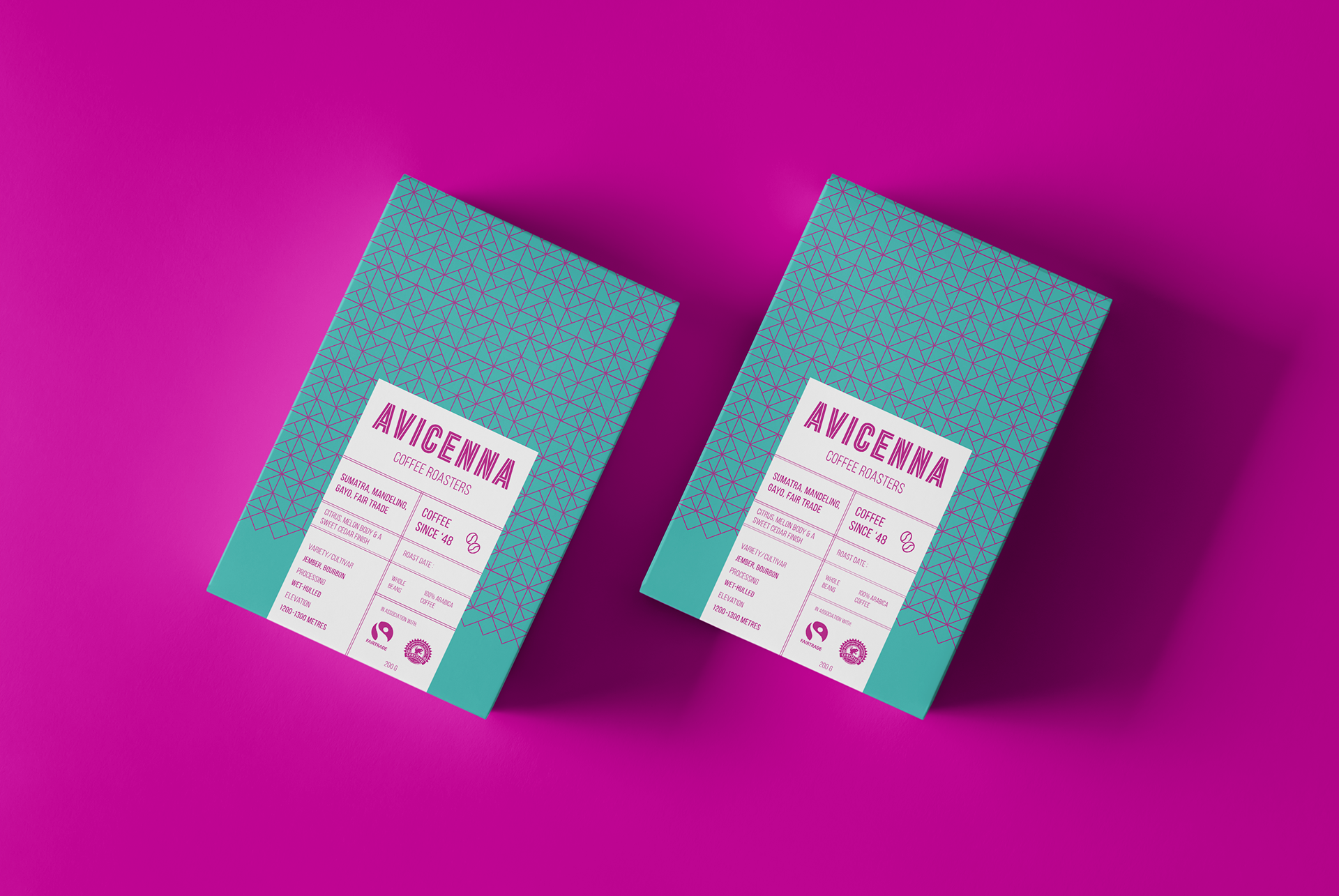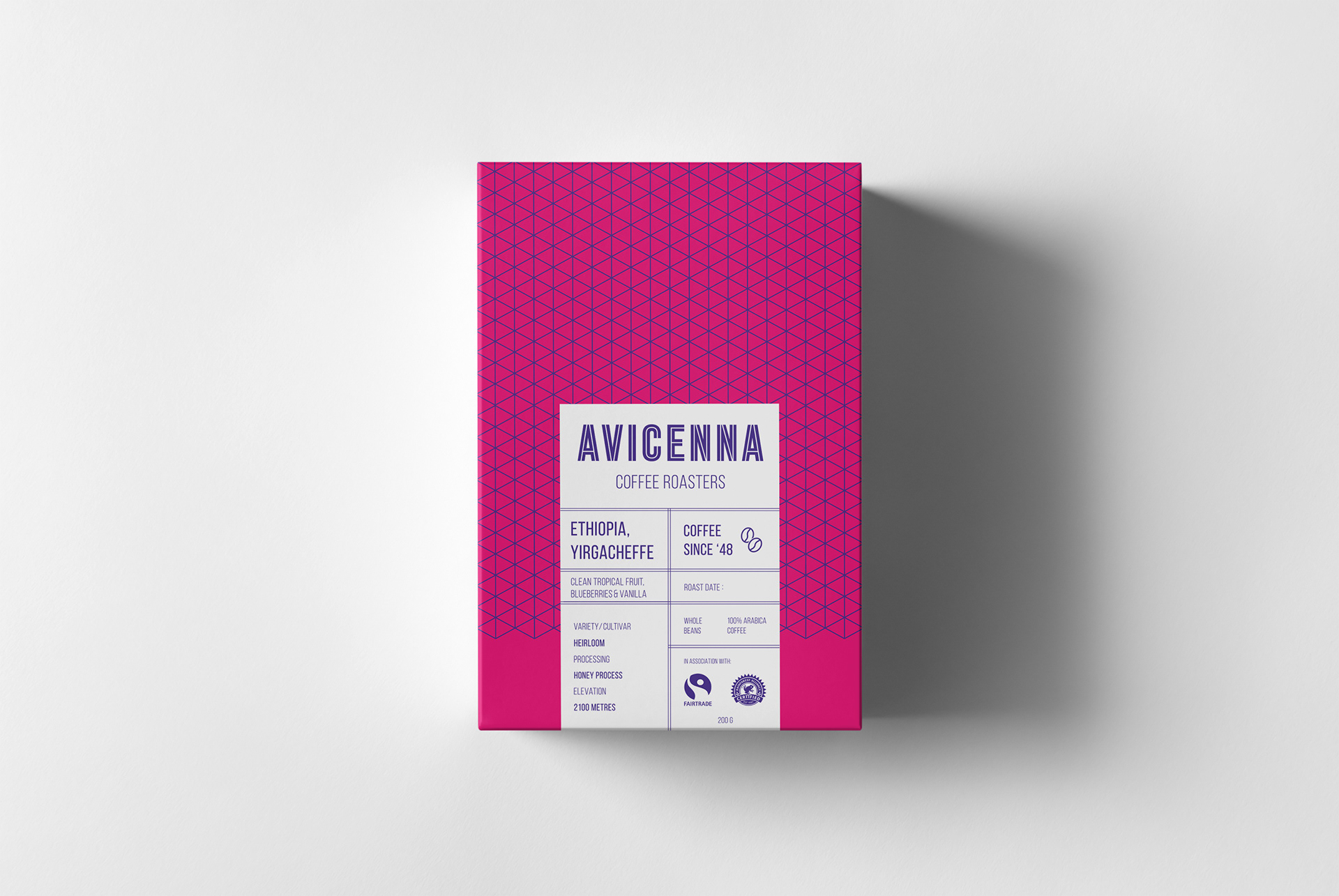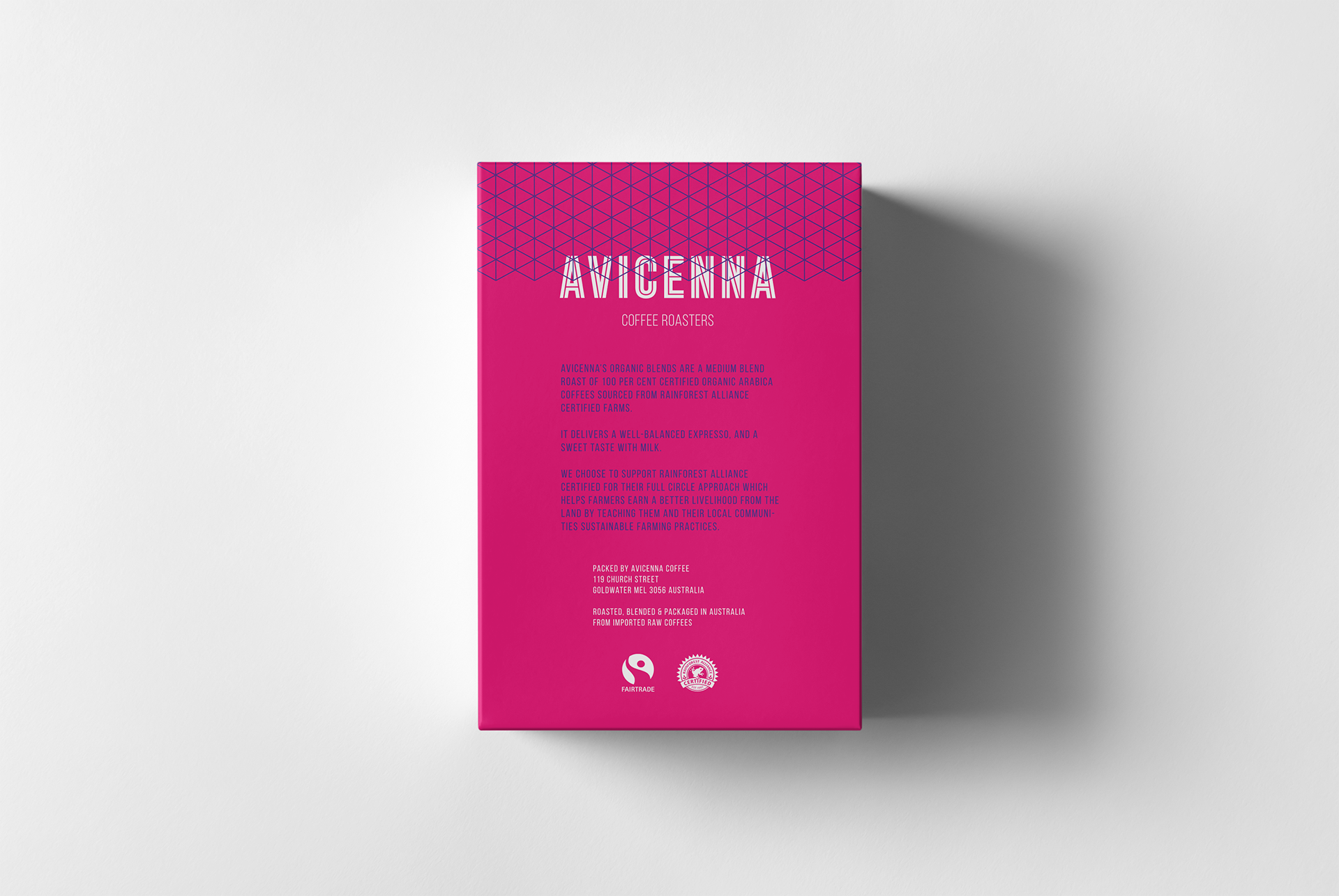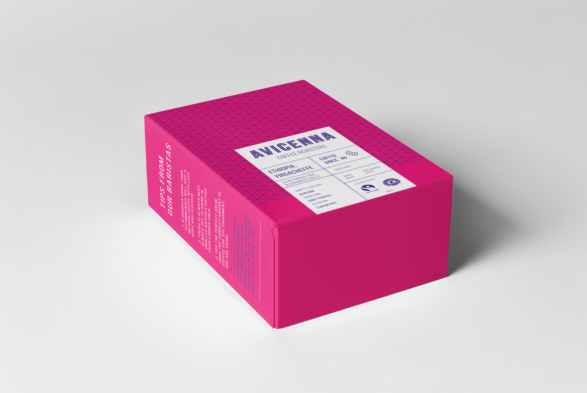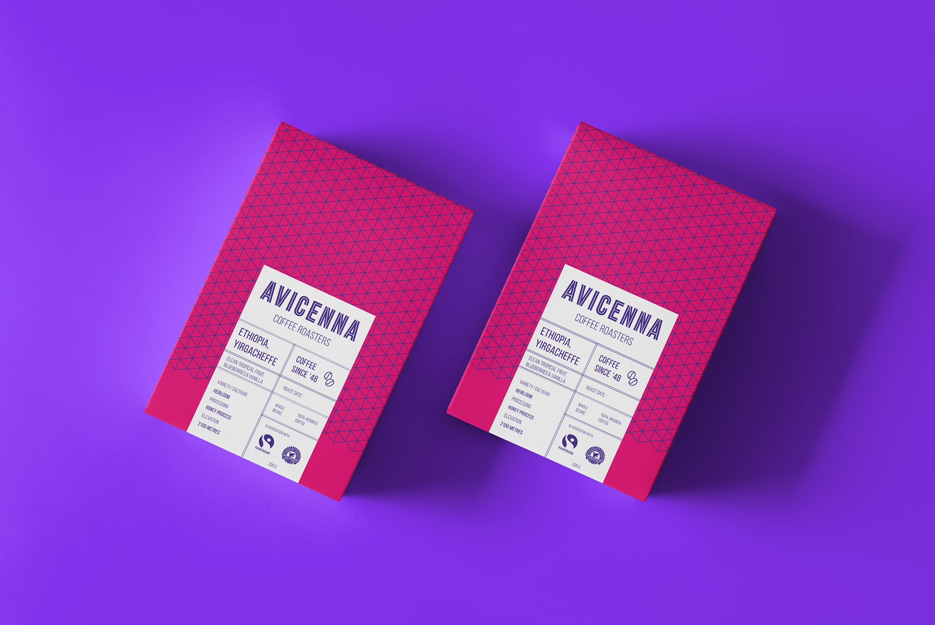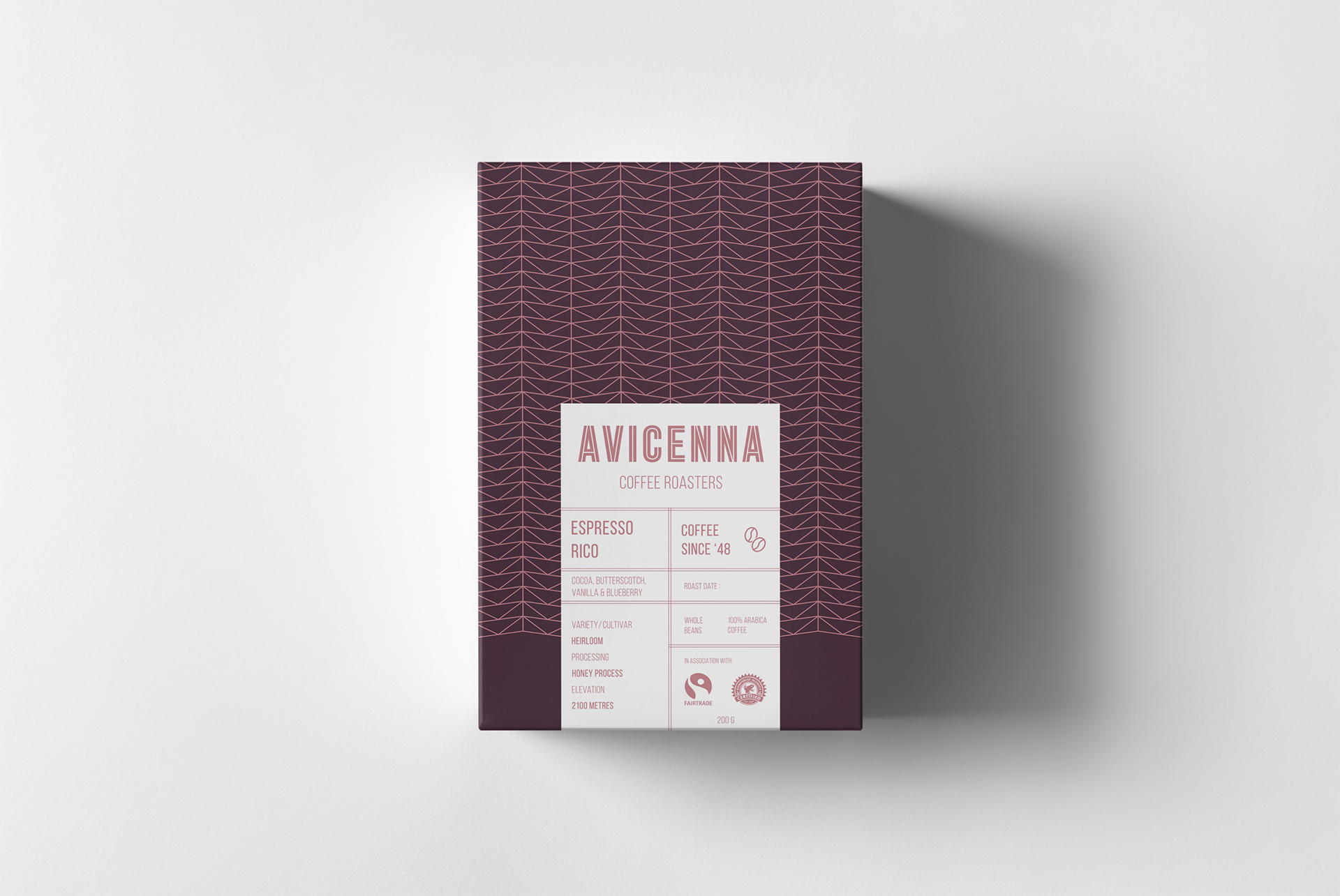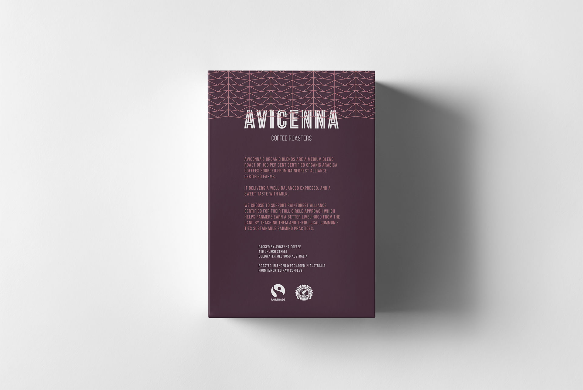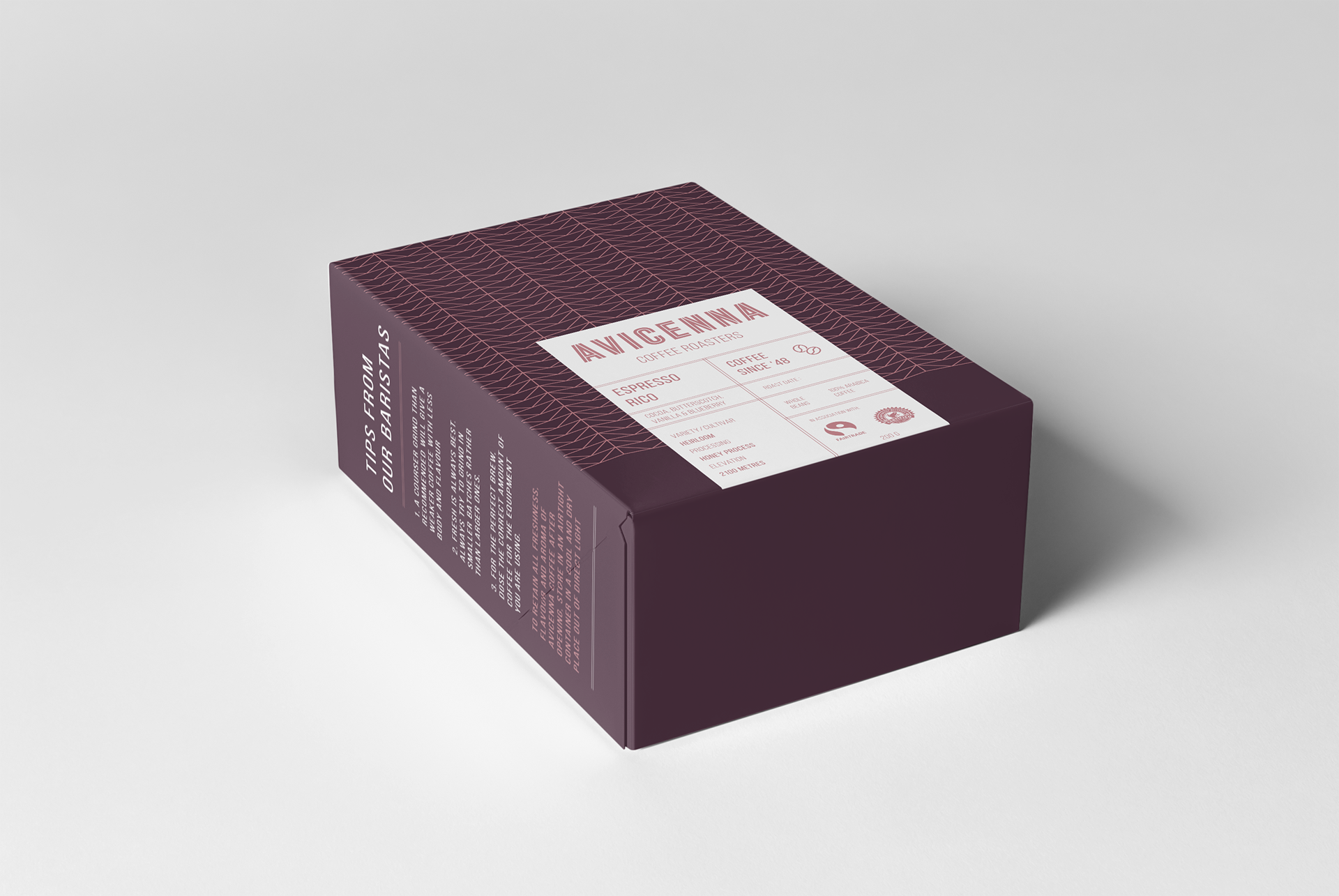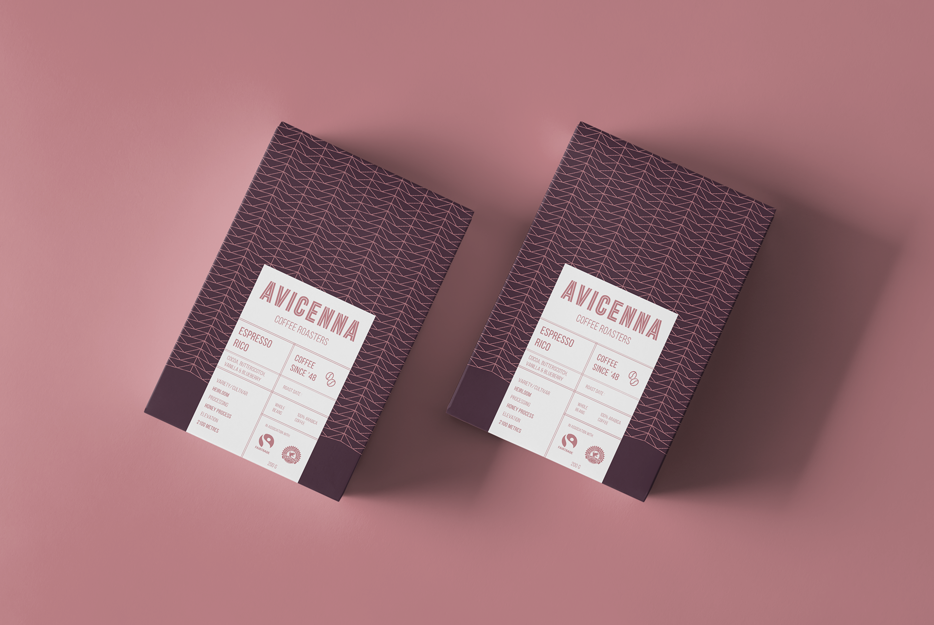
Avicenna Packaging
The brief commissioned us to exploit the potential of a carton board box for packaging and communication. We were also asked to design surface graphics for three boxes each of which contains a different variety of one product. Being only allowed two colours only for each box. A solution that creates variation in the surface graphics beyond a simple change of colour between each box was also required.
The box was intended to be produced using light carton board. The colours I used in my design and mockup aimed at enhancing the visual aesthetic and appeal. While it could have been interpreted as counterproductive, the final product was a testament to how less can convert to more in design terms and affect.
Aside from using minimal colour shades, the design also features geometrical accents that are emblazoned onto the product. As consumers seek out a sense of minimalism and attention to detail from even everday products, the Avicenna packaging identifies how brands and designers are responding with simple branding aesthetics.
The name was also inspired by a Mohammedan philosopher and physician named Avicenna Bukhara, who described the medicinal properties of coffee, also calling it bunchum in the pre-1600's.